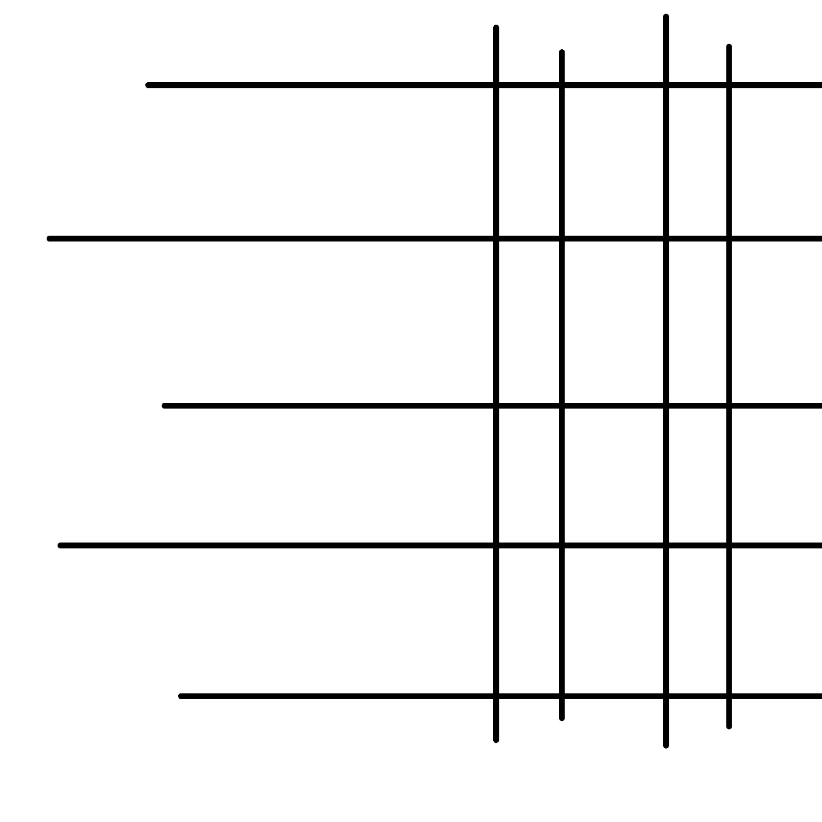
The nonobjective shapes are the square that the triangles seem to makes swell as the "X" shape that is in the middle of it.
Sunday, September 29, 2013
Negative Space
The negative space is the white shape created in the center of the "flower" as well as the surrounding white area.
Saturday, September 28, 2013
Friday, September 13, 2013
Thursday, September 12, 2013
Tuesday, September 10, 2013
Lines
The trees on the other side of the water are showing lineup to the sky. There are also lines for either side of the stream.
Sunday, September 8, 2013
Bad Composition
This is bad composition because the books on the bookshelf are leaning different directions so there is no pattern, and the random umbrella takes it off balance anyway.
Bad Composition
This is bad composition because there are too many boxes that are not even or the same color so they do not create a balanced pattern.
Good Composition
This is good composition because the black windows create a pattern and only the sky is seen through them.
Good Composition
This is good composition because the lines and colors are symmetrical and lead your eyes to one place.
Good Composition
This is good composition because the color all goes together and it is clear what the subject of the photo is.
Bad Composition
This is bad composition because there is too much going on, all the people in the stands behind the band causes it to be off balanced.
Subscribe to:
Comments (Atom)


.JPG)


.JPG)
.JPG)


